
Designers have long extolled the virtues of using neutral colors in furniture and interiors. Earthy and impartial, neutral hues feel quiet and calming. They invite zesty accent colors and keep furniture decorating options open down the road.
Home furniture design trends from Paris would concur! The recent Maison & Objet Show in Paris was covered, head-to-toe, in neutral colors. But it was Mother Nature’s cooler, wintery hues on display, captured in colors of bare branches, weathered woods, stone, marble, snow and laundered linens in winter whites. Complex tones contrasted even more complex tints. The effect was shadowy and sophisticated; chic and modern on one hand, warm and embracing on the other.

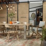
After a decade entrenched in deep chocolate hues, brown is migrating to mocha, mink, camel and other lighter versions. But it’s gray that’s emerging as the new go-to neutral. Much more than the halfway point between white and black, gray boasts an impressive range of variations – mushroom, stone, pewter and charcoal, among others. This cool, versatile neutral can add a dressy touch to casual textures, or a modern touch to dressy textures. Sophisticated neutrals like gray are used extensively, for example, in Hooker Furniture’s new Melange Collection. Melange, which is French for “mix,” is an eclectic collection of one-of-a-kind artistic accents in inspirational styles. And for those with a foot still in the brown camp? Not to worry. Look for taupe to be a front runner, with its unlikely brown and gray undertones.
In such a sea of subtlety, accent colors are stepping up – from splashes of yellow-green to bright white… and yes, purple! An exciting new color in fashion world, this moody, mystical color exudes elegance, refinement and luxury. From plum to amethyst and violet, expect shades of purple (especially grayed-down or with warm, red undertones) to work their way onto pillows, throws and more.
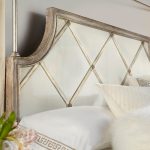
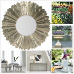
Ironically, the last word on Paris color trends goes to… texture! With both sleeker and bumpier materials heading our way, color is taking on complex, three-dimensional (rather than flat, two-dimensional) traits. Applied to pearlescent and metallic finishes, colors look ethereal and translucent, such as in the antique mirrored consoles with gold leaf finishes in the Pinnacle Design Award-nominated Sanctuary Collection. Applied to nubby, woven, washed or distressed materials, colors look warm, soft and understated. Even extreme light and dark color schemes associated with modern style look warm and touchable!
If Paris has anything to say about it, cool neutral colors will reign at home for the next while. But they’ll be less tied to contemporary looks, spreading their chic, quiet appeal to rustic and classic styles too.


{ 0 comments… add one }