How do you want to feel when you come in the door? How do you want your family to feel? What about your guests? Color is the most compelling element in any decorating scheme. Like perfume, it gets right to our emotions! Whether your taste runs to cool and serene, warm and exciting or a balanced blend, there are colors that will carry your message throughout your home.
Best of all, when you paint your walls or buy upholstery, it costs no more to choose colors you’ll love to live with. Take a look at these rooms, decorated with some of 2012’s most versatile hues, and see how powerful color can be!
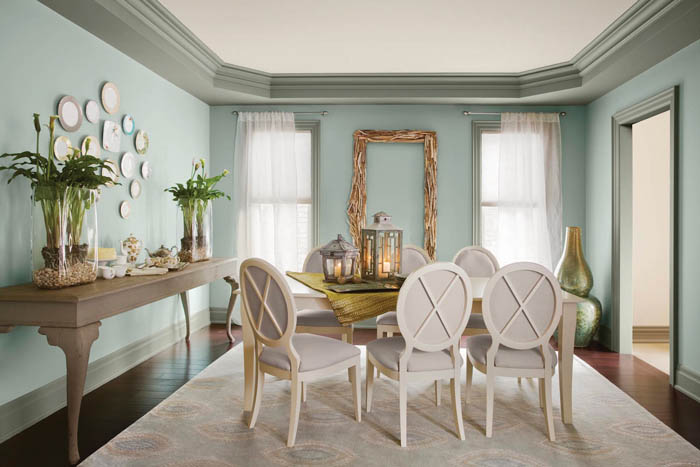
The above photo features a dusky blue-gray wall as in Montpelier from Benjamin Moore. This gives walls a sense of depth and rooms a feeling of coolness and dignity. Grayed mid-tones like these are among the best for hiding everyday wear, so they’re great choices for upholstery as well as walls. Blue-based hues also contrast with tawny woods and other warm tones to create a rich feeling of balance.
In this room we see sophisticated neutrals which bring a sense of natural quiet comfort.
Layering warm brown and cool gray neutrals adds the visually rich, yet subtle effect of texture. To get the feeling, wrap your walls and large furniture pieces in shades like Benjamin Moore’s spice brown Masada, soft beige Farm Fresh and pale gray Revere Pewter. (Paler, cooler neutrals expand space while darker, warmer ones make it cozier.) Then spice it up with dusty coral Persimmon and vivid Gypsy Love red-violet.
Sometimes you just have to kick up your heels and go for the freedom of intense color, as shown in this room featuring Behr’s “Retro Recall.”
Intense color is great for kids’ and teens’ rooms, media rooms, airy loft apartments and other spaces where fun is on the agenda. If your room is big, pour on the fearless color; if it’s small, give one wall or key pieces assertive hues and keep the rest calm so you won’t feel crowded. (It’s true: hot colors really do “feel” like they are coming toward you!) Behr’s “Retro Recall” palette generates unbeatable excitement on any decorating budget. Here, high-energy hues of LOL Yellow and Red Wire are nicely grounded by sky blue Reboot, leaf green Level Up and urbane Game Over gray. It’s easy to find small accents in all these crayon-box colors so decorating couldn’t be easier.
Southwest style is hot, but wherever you live, streamlined modern and earthy rustic looks come together in a palette like Behr’s Santa Fe Today.
In fact, if you’re a bit short on furniture or accessories, flattering, warm hues like these help “fill up” a space in style. Here, Prairie Poppy makes a foyer warmly welcoming, Darlin Clementine andLone Star lend a flattering, rosy terra-cotta and golden glow to wall and ceiling, and CanyonSunset adds cool shade. Stagecoach brown adds drama to the fireplace and ties in furnishings.
To make “investment” neutral colors safe, not dull, make sure you fill the room with interesting shapes and textures. If you’re a world traveler (or just a fan of ethnic, museum and import shops) you’ll find global inspirations galore. Behr’s “Safari Escape” palette scouts out relaxed neutrals that set off dramatic furniture and accessories in styles from British colonial to rustic/lodge.
Sculpt a room with a trio of grays (medium-gray Compass, pale smoke Livingstone and warm gray Jackal) and versatile, soft taupe Serengeti Dust; add drama with deep chocolate Tribal Drum.
Benjamin Moore’s 2012 trend color, Wythe Blue, lends a serene and spacious air to any room.
Wythe Bluealso sets off neutral and pale furnishings with cool elegance. It’s from the company’s Historical Color collection, so it’s timeless as well as fresh. Use a soft, grayed aqua like this on the walls or in upholstery; its softly dusty tone is practical as well as pretty.







{ 0 comments… add one }