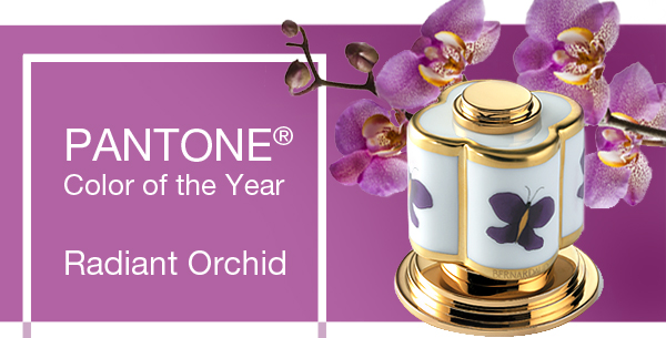
Many of us fear pinky-purple as waaaaay too girly and sweet for the living room or master bedroom. But around the world it’s a different story: The intense fuchsia of T-Mobile is a European staple, and as legendary Vogue editor Diana Vreeland famously observed, “Pink is the navy blue of India.” Now, Pantone has brought “Radiant Orchid” home as the 2014 color of the year, so you have a great excuse to indulge in this international favorite. The trick is to give orchid an edge. Here are three easy ways to make it work anywhere in the house:
1) Heat it up with any shade of orange or red.
2) Bounce it off of its color wheel complement, yellow-green (chartreuse, olive, old gold, lime.)
3) Sharpen it with urbane black, white, taupe or gray.
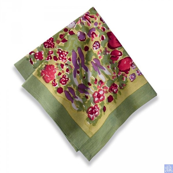
For example, on this napkin from Couleur Nature®, you can see how opulent orchid looks when paired with berry and olive.
Wine with everything: The design of this Art Deco-inspired Sam Moore reclining chair has an edge of its own, but the elegant color, surrounded by cool neutrals, makes an even more dramatic statement. Even lighter hues like lilac can be tough enough with a setting punctuated by black, gray and taupe. Balance the big color with at least two other shots of orchid throughout the room.
Black lends a savvy urban edge to romantic orchid in this dress from White House Black Market, — just as it could in major furniture pieces for the home.
Modern style and a black-and-white palette can be clean without being cold. Just add some frankly sensuous pinks, reds and orchids as in this exuberant Le Jacquard Francais tablecloth at www.yvonne.estelles.com.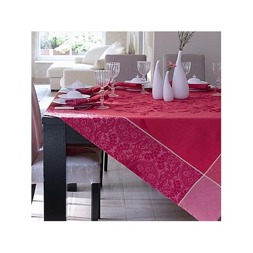
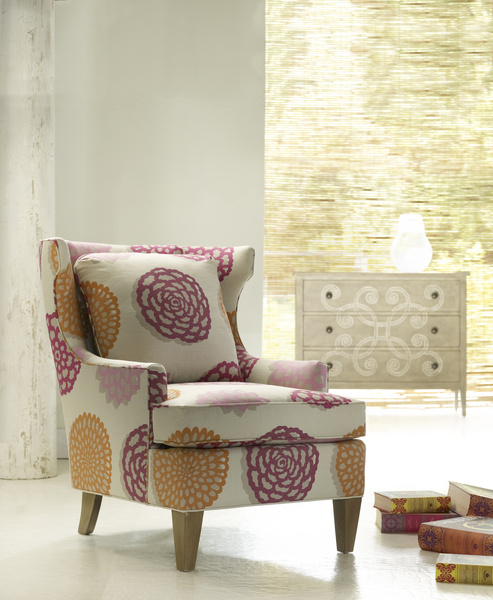
In a retro look reminiscent of the flower power of the 70s, modern florals in deep orchid and yellow-orange are fun and chic against a neutral ground in this Burke wing chair from Sam Moore.
Add a pink-purple orchid plant in a plain terra-cotta pot to pick up the soft orange hue, and you’re done!
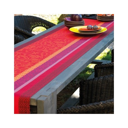
You’ll get a rich, soft effect when you use red and orange along with orchid, because they’re cousins on the color wheel. Pick up the scheme from this Le Jacquard Francais table runner at www.yvonne.estelles.com.
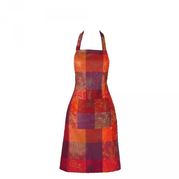
Spicy, not sweet, is the effect on a party-ready apron from Garnier-Thiebaut at yvonne-estelles.com that harvests warm, analogous (side-by-side) colors.
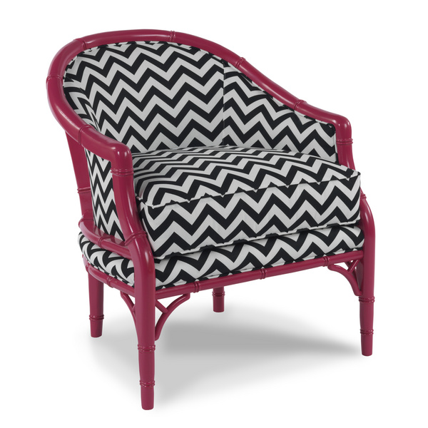
Here’s a bold twist to wake up any room; put the orchid on the frame, not the fabric. A fierce pattern or neutral solid – black, navy, charcoal, taupe – would be aces to complement this painted wood finish.
Imagine a black-and-white marble tile floor, other furniture items in black lacquer, and silk toss pillows in bright orchid and acid green. Tres chic!
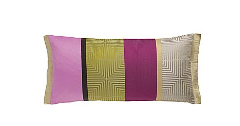
This silk pillow from Designer’s Guild says it all about how to toughen up orchid for the main rooms in your home. Berry, taupe, black and gold-green make orchid versatile and sophisticated.
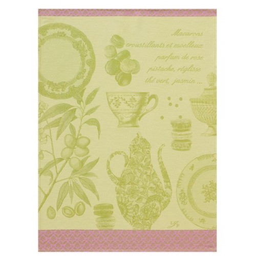
Pistachio and pale orchid are as inviting as an English garden, brought home in a kitchen towel by Le Jacquard Francais at www.yvonne.estelles.com.
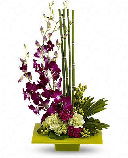
Orchid is in the red-violet family, so pair it with any yellow green for a foolproof, fabulous complementary scheme, as the folks at Teleflora did here.
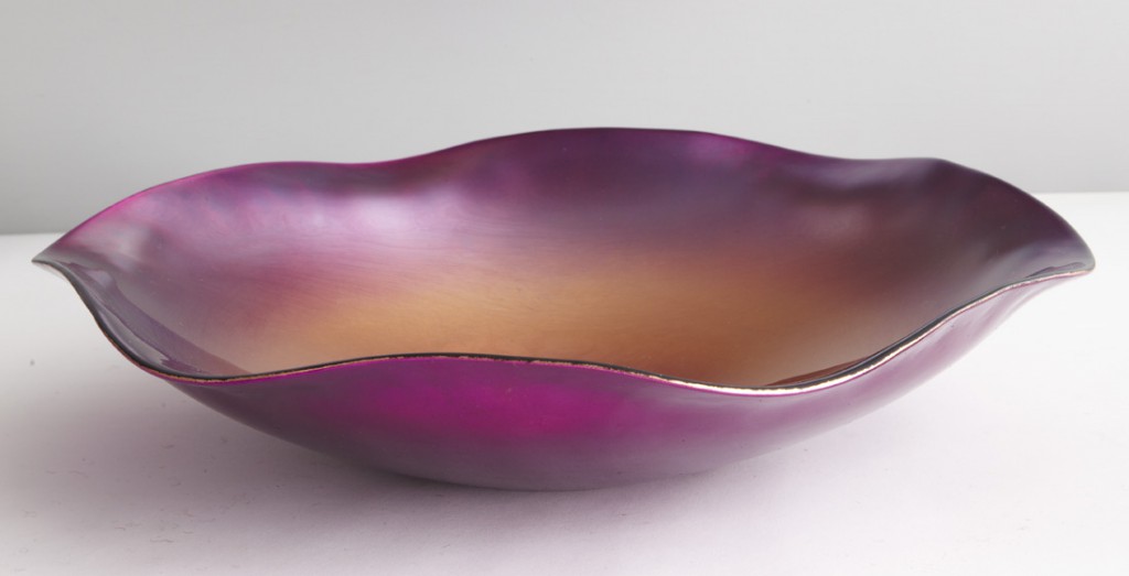
A swirl of orchid-purple and gold makes this bowl from the Art Institute of Chicago shop an opulent accent. Make the most of a vibrant hue by using it in at least three places in your room.
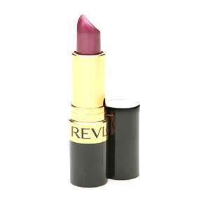
For a fresh look, try the orchid trend in a lipstick like this surprisingly wearable “Iced Amethyst” by Revlon.








{ 0 comments… add one }