Clients often ask me how on earth I process all of the information and inspiration from my visits to the High Point Furniture Market. I’ll have to admit it’s a week of information overload. Walking, taking photos, attending events and presentations, walking, taking more photos, making notes of the new introductions, walking, catching up with design peers . . . and did I mention . . . walking?
When I finally get settled back at the desk, I download hundreds of images and several design themes appear right before my eyes. I most definitely keep up with what’s being shared in the trend reports, but I tend to have an organic way of letting the pieces of the puzzle come together.
I’ll share some of my photos, finds, and observations as we move into the trends that will impact interiors over the next months and years. Keep in mind; some of these are a reimagining of designs which have come before. Interiors are very much like runway fashion, in that respect.
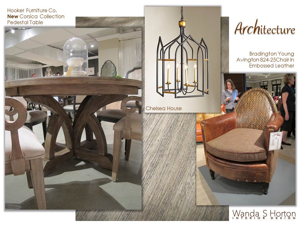
As I looked through my market photography, arches were a recurring element. An upcoming project has directed my attention towards shapes. While color was a huge story at this market, the client I am working with now is going to be more attracted to neutrals. Strong architectural elements will help me to keep the design dynamic.
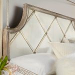
The new Corsica Collection from Hooker Furniture uses arches and other classic design themes, along with an organic color palette featuring a natural finish on Acacia wood. Acacia wood has lovely, subtle color variations in the wood grain itself that are visible through the finish.
Sister company Bradington-Young offered the vintage leather club chair in the ARCHitecture design theme illustration above with a striking arch punctuated by a Gothic-looking embossed leather pattern.
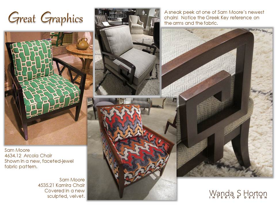
When designers work with clients, we inquire as to pattern preferences. In previous times, we often looked to florals as our “go-to” pattern. Thankfully, we’ve got many more options today, not only in fabrics, but in the furniture design itself. Graphic/geometric influences are pervasive today, as seen in these new chair covers at Sam Moore Furniture.
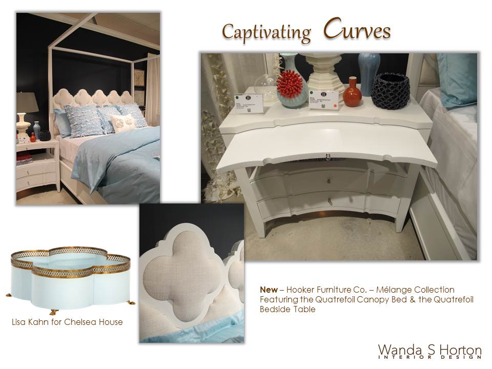
On the softer side we’ll continue to see curves in elements like the quatrefoil, circles, ovals and other motifs that are sleek and sophisticated.
If you’re on the fence about going totally modern but you’re ready to leave some traditional design behind, think about pieces like the Quatrefoil Bedside Table added to Hooker Furniture’s Melange Collection at the recent Spring Furniture Market. Bringing these types of pieces into your interiors allows you to move between the best of both worlds. Accent with either a modern/abstract painting or a soft, classic landscape and you can easily change your direction!
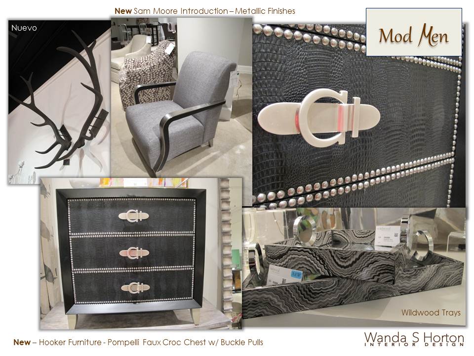
I witnessed a growing number of fabulous options for more masculine or tailored projects this market, and have dubbed this trend, “Mod Men.”
Often we tend to think of “chunky” pieces when we hear the word masculine, but these introductions totally dispelled that perception!
The new Pompelli Faxu Croc Chest, also from the Melange Collection is a perfect example.
A sartorial elegance, with details in finishes, nailheads, skin textures, patterns, hardware . . . can you feel my excitement?
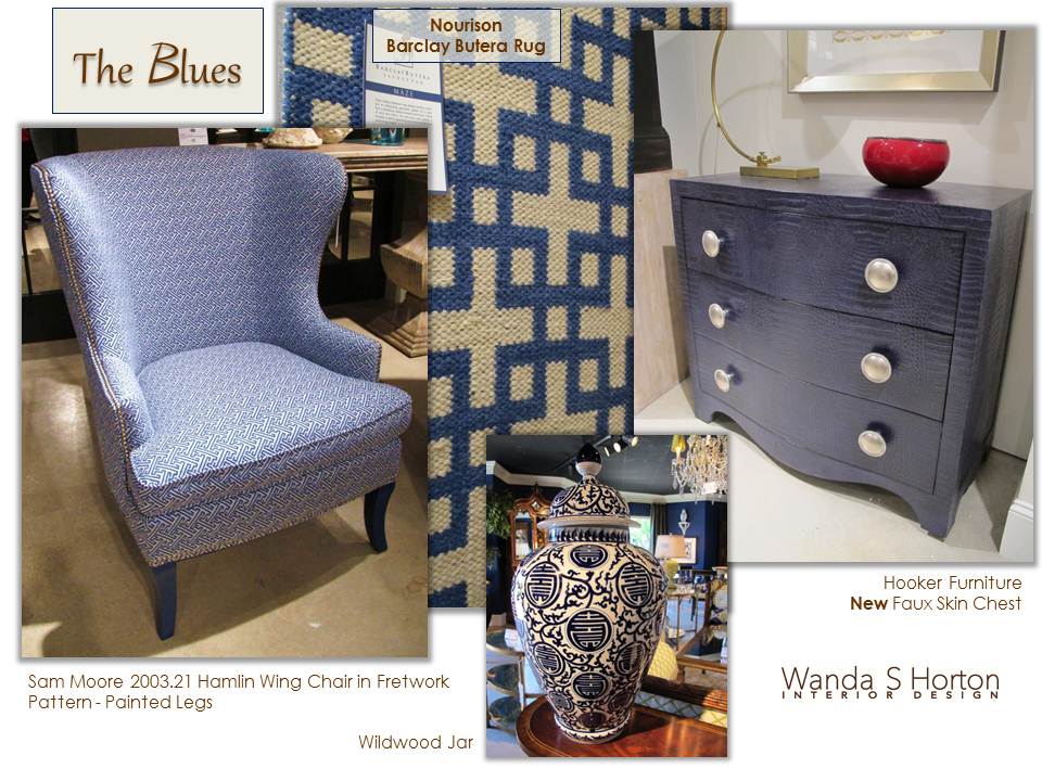
While the color of the year, Emerald Green, (selected by Pantone), certainly made a showing, it’s my personal opinion that blue was the big story.
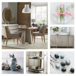
As you see from this design theme board, every option from periwinkle to deep, ink shades graced selections from fabrics, painted finishes, porcelain, rugs, walls, lamps, you name it! Blues are soothing, stately, and make it easy to add other color for a special pop. Think of taking your walls to a pink/coral hue or a deep, goldenrod – it’s all about the backdrop. And guess what? Certain intensities of blue would work beautifully with that emerald trend, too!
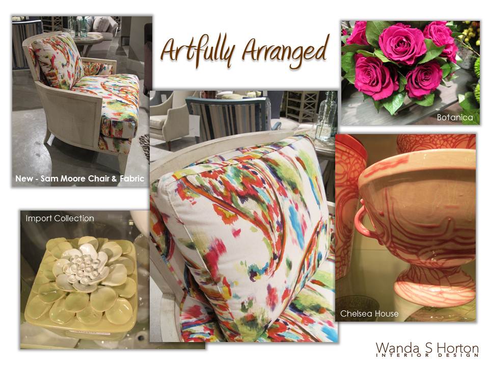
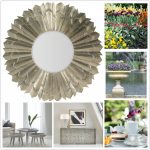
Home furnishings are not only about fashion and function, they’re also about art.
I especially loved seeing this artful direction, because I appreciate the talent it takes for a designer to create product with the feeling a lot of hands have been involved in the process. (And that’s very true, in most cases.) The stroke of a brush, the molding of a container, the placement of an embellishment, the carving of a leg . . . I’ll admit, this is what makes my heart flutter for my own personal style.
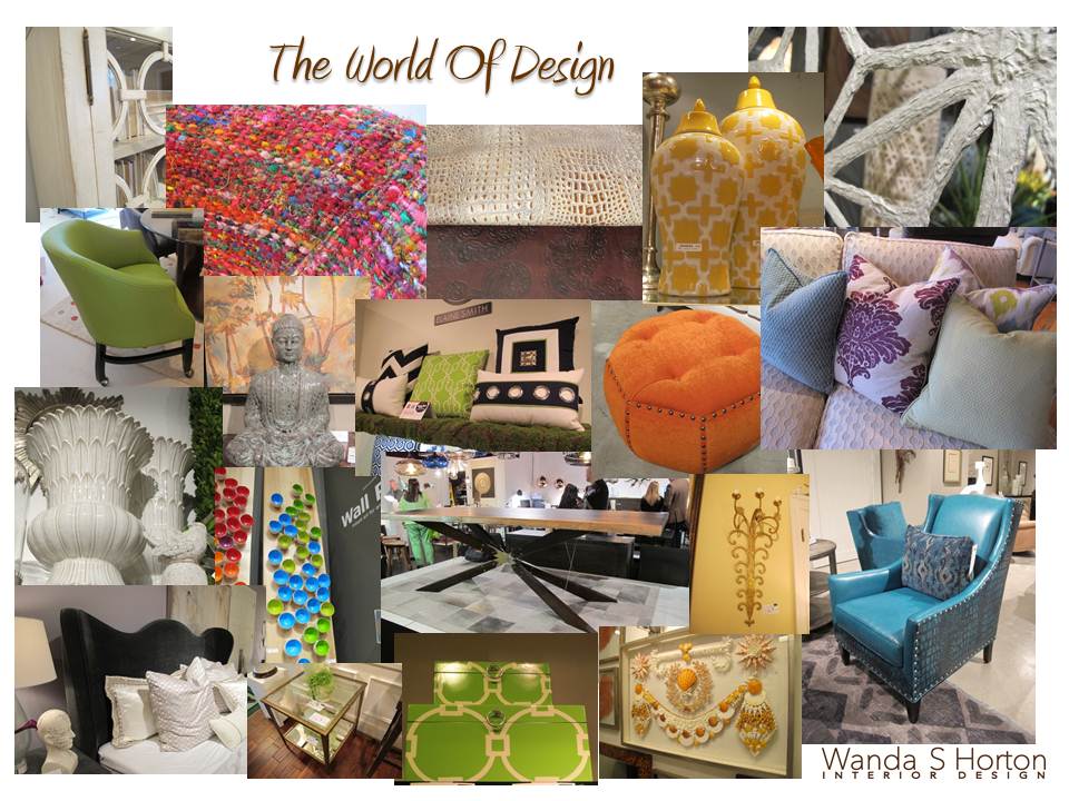
There is a world of design waiting for you! I’m so privileged to have been extended the passport to be able to share some of it. I hope my pairings have provided you not only with some inspiration, but also some great tools as you ponder how your interior stories will unfold.





{ 1 comment… add one }
A great post and Pics. As boring as furniture can be, I enjoyed this post.
Thanks
Eddy