A few years ago, when a young teacher decided to purchase her first residence in a townhome community, it came with the bonus of being one of the model units, so it was move-in ready. No worries about selecting a lot of furniture, colors or even window treatments! As time passed, she felt it was missing some of the function she needed, and was missing her own personal stamp of style. I was so pleased when she asked me to help create a jewel box interior, as I had also been the designer for her mother’s home. I love sharing interior stories which span the generations. Keeping it in the family makes it even sweeter!
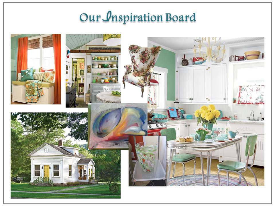
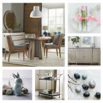
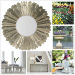
Every project has to have a starting point and while I certainly had some ideas for helping to expand the space, both visually and storage-wise, I wanted to be sure I had a grasp on her vision of what a modern cottage style was all about. She had saved some images from magazines and online sites, and we created a compilation of them for reference. I’ve shared just a few of them, below:
Sometimes our collected images aren’t always for literal purposes. They give us a great opening for conversations and allow for the defining of key elements or lines. This exercise was more about a feeling she wanted her home to bring to her, when opening the front door at the end of a hectic day.
Look back to the previous board. You may notice if all of the colorful accents were stripped away, there would be a mostly white furniture and surroundings with one prominent color contrast. Upon further examination, a lot of the accents were either vintage or one-of-a-kind artistic pieces. That’s where we began her design process.
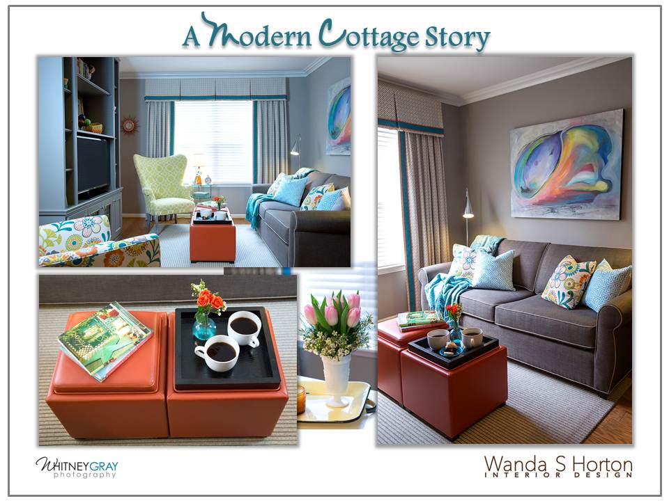
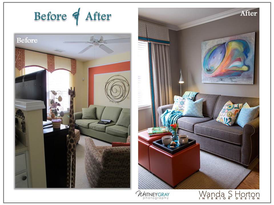
It is amazing how the application of color can make a huge difference in the suggestion of space. You’ll observe, while very fun, the previous interior had a lot of advancing colors, mainly yellow and orange, and they were separated in a way that stopped the eye, rather than offering a more open “horizon”. Grey was a color that my client had come to fancy, so I had her sofa recovered in a slightly deeper grey to keep it from totally blending into the soft, flannel wall tone. We layered the windows in a fretwork pattern of grey and white and the area rug was in a grey ribbed wool with silver metallic threads and with a bit of woven turquoise. The modern art piece brought in a touch of drama and we did a spin-off of accents to help balance it. What a difference!
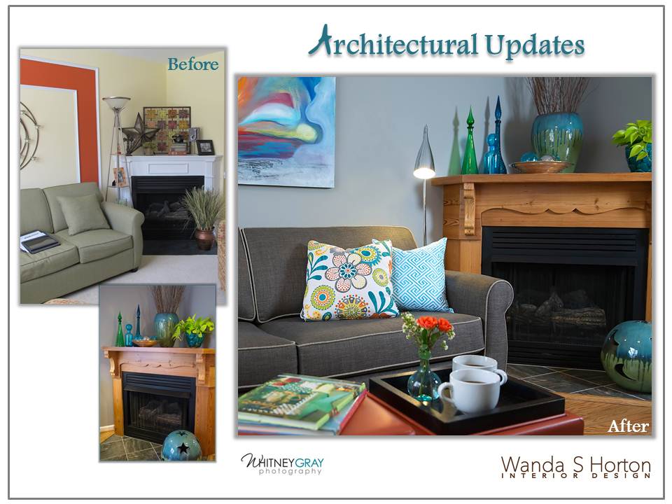
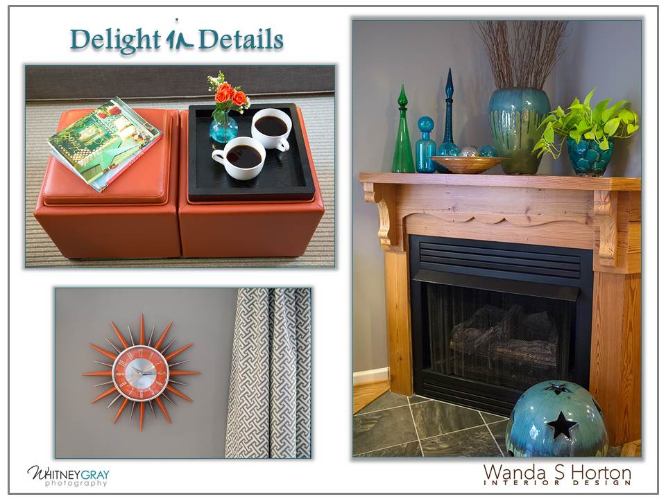
Sometimes, when spaces are of a jewel-box scale, it’s easy to think the architecture has to be minimized. We did remove some choppy chair rail in the entry and the dining areas, (watch for my next post to see those spaces), but it didn’t mean we had to be devoid of other character-building trim details. The previous fireplace surround felt a little utilitarian. I had seen a gorgeous, antique mantel while traipsing through a vintage mall. It provided the design motif for the beautiful, reclaimed heart pine creation which now graces the corner. We also added crown molding to wrap over the ceiling, giving the illusion of expanded height. Built-ins helped us to address the broken feeling of the previous half-wall divider, as well as they beautifully took care of storage requests.
As we know, it’s all about the details . . .
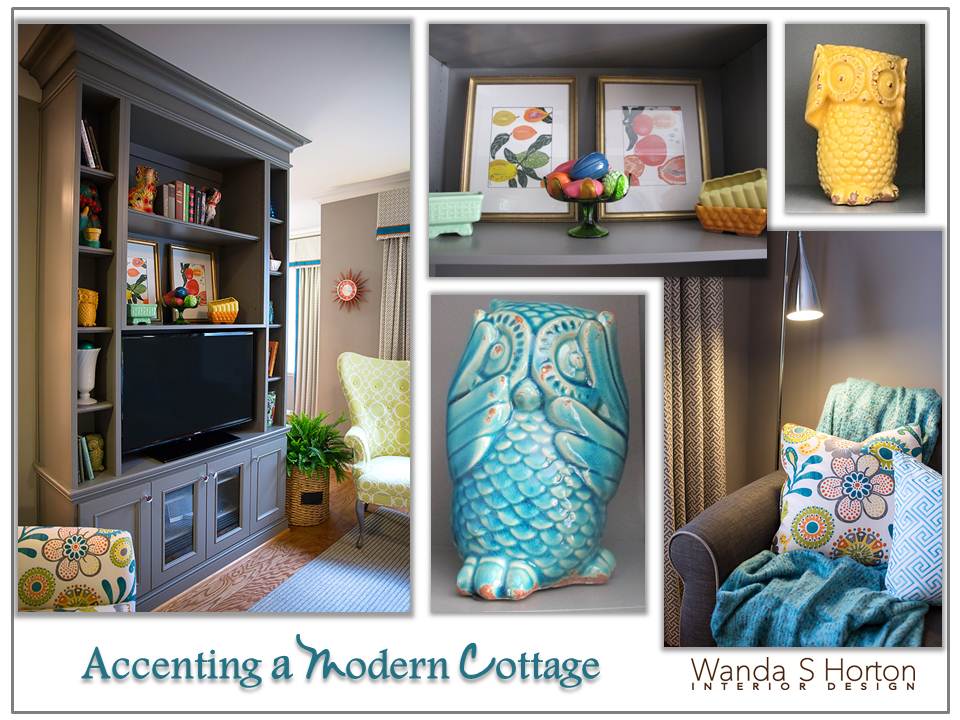
And . . . the accents. They should always be about the homeowner and their personality, don’t you think?
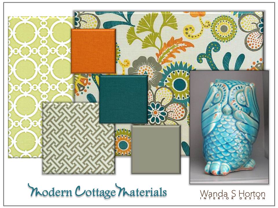
In this instance, through the process of collecting vintage finds, it made it easier to select the fabrics and materials to complement the wide variety. A little retro-influence in the floral pattern, paired with the modern, geometric prints gave us an interesting mix without overwhelming the space. See that wing chair near the grey built-in? It’s in the inspiration board. Yes, another great scoop on a sourcing trip. We recovered it in the ring pattern and the legs were finished in brushed pewter.
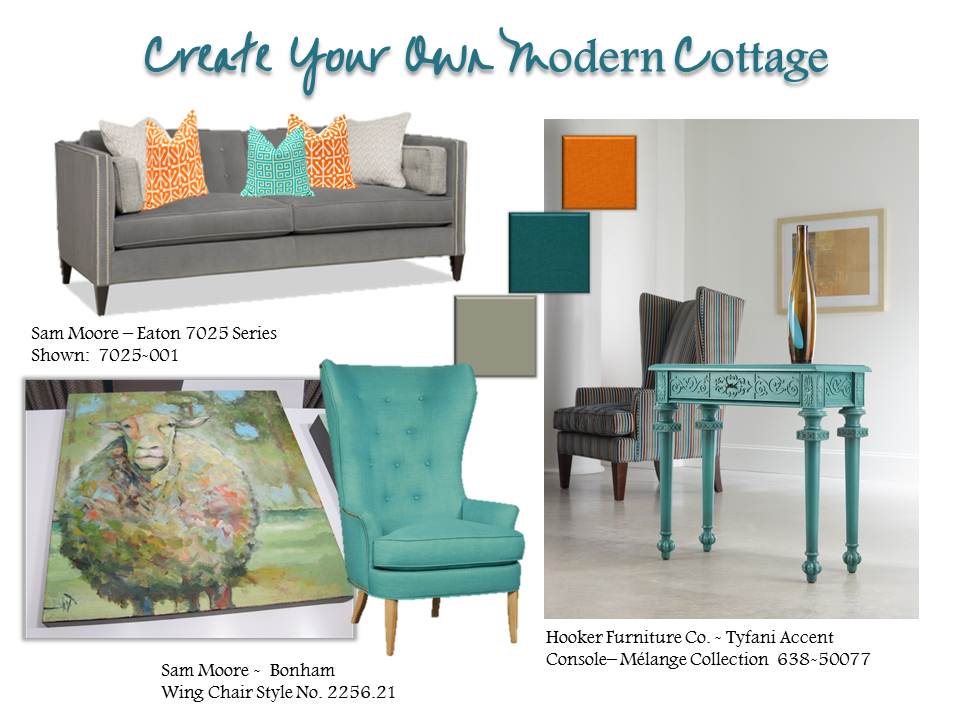
This has definitely been one of my most fun projects, to date! Of course, I’d love for everyone to have a home which brings in the cheer. I’m so happy to know the folks at Hooker Furniture Company and Sam Moore have some of these options for you, too!
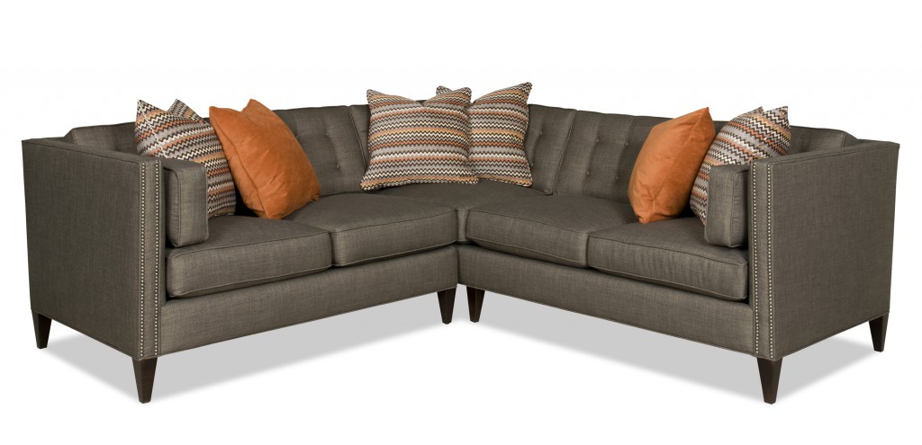
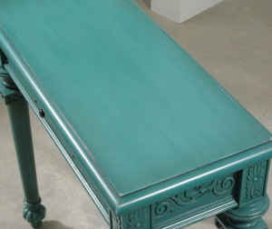
You can start with some core pieces and add a splash of your own style. There are many color options and patterns available. I loved the Eaton Series Sofa shown in the design board above. If your space is a bit larger, you have the option of expanding this design to a sectional. The Bonham Wing Chair , also above, wraps you in cozy comfort and is very similar to the vintage chair I sourced! The Mélange Collection’s, Tyfani Accent Console is so current with a gorgeous, painted finish and detailed style. It’s a piece that could be used in multiple places because of its flexible scale.
Sam Moore – Eaton Series Sectional
Tyfani Accent Console Table Top
This story has more chapters! I hope you’ll watch for the next one. There will be cupcakes!





{ 0 comments… add one }