Bravo to House Beautiful magazine for asking some of our best interior designers for their decorating secrets! There are 101 ideas for you to peruse, and most are just reminders of things we can do to make our homes and furniture look and function better. The very best of the ideas are guides that are cost-free.
Here are a few pointers that simply make good decorating sense:
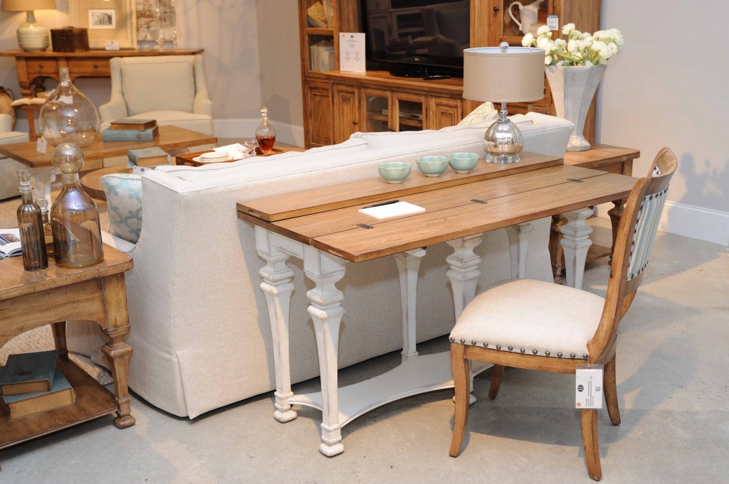
- Where to place the sofa: Even a few inches of space from the wall will bring your sofa into the room in a much more pleasant way. But designers often place large-scale seating far from the walls, as in the arrangement shown above of a functional sofa table from the Chic Coterie collection, nestled against a sofa that is in the middle of the room. The table has a flip top that can open for all kinds of extra space, a wonderful addition when entertaining.
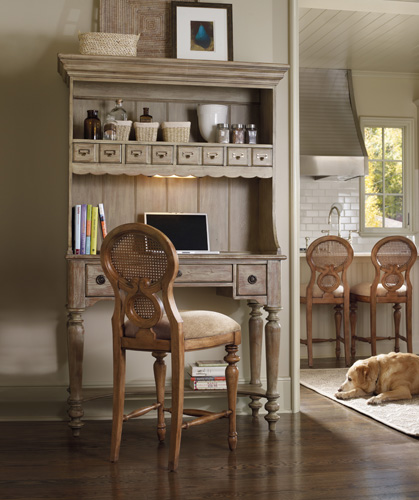
- Small space strategy: The inclination is to use a small space effectively by scaling down the furniture and accessories. Believe it or not, large-scale pieces will make the space function well for you, as well as giving the space more emphasis. What about that eating area located off the kitchen? A multi-functional, impressive furniture piece like this Primrose Hill Organizer Hutch illustrates exactly how this small space strategy works.
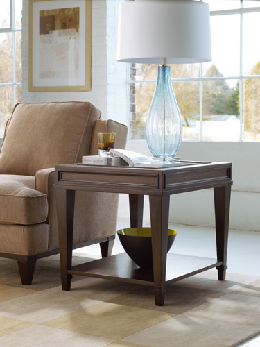
In the same vein, use a large-scale item to add drama to a room, such as the lamp on this end table from the Ludlow collection.
The living room table has a walnut veneer, an interesting fretwork detail, and a glass top, adding a little drama of its own.
- Editing collections: The lure of shelves sometimes entices us into packing them to the gills. Breathing room is a much better way to display the things you love most. You might even want to keep a closet or storage space specifically designated for parts of your collection. Seasonally, you can rearrange your displays. It makes for a more dynamic decorative display–and keeps you engaged with your collectibles.
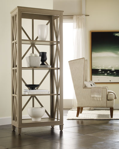
Less is more is the principle illustrated by the accessories displayed on this Holden Etagere.
The cabinet allows for each display piece to have enough space, allowing you the opportunity to appreciate and savor the beauty of each special item.
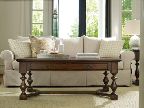
- Best placement for the coffee table: A good rule of thumb for the coffee table is to keep a minimum of 15 inches between the table and the sofa. This simple move will make a big difference in comfort. A little more space is always a good idea so you don’t end up with your knees under your chin–so to speak.
Coffee tables are often the workhorses of the living room. But they too need their day in the sun. This Classique coffee table also has several useful drawers within arms reach.
- Lighting guidelines: When shopping for lighting, keep the following pointers in mind: For dining rooms, 60-watt blubs are recommended; for living rooms, the range is 75-100. The best lighting in the living room is at eye level and not above where it will create shadows. And when selecting lampshades, the best choices are white or off-white.
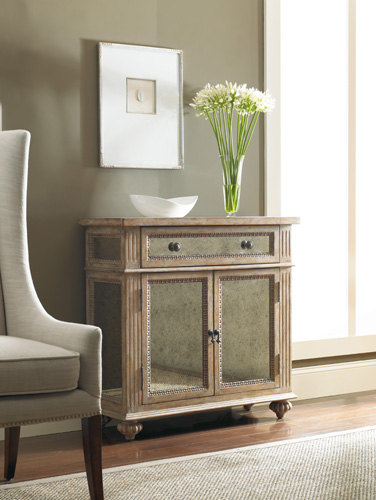
- Placing artwork and mirrors: If you have a small picture or painting, avoid placing it directly over the piece of furniture, whether it be a chest or sofa. Being off-center will make the space more pleasing to the eye as in the arrangement over this antique mirrored chest.
When hanging artwork, a general rule is placement 63 inches from the center of the art to the floor. And for mirrors, never hang between two windows, as the outside view is often the main focal point.
- Sum: We often spend lots of time and money on decorating without paying attention to the little things that mean a lot. Designers take the knowledge of these guidelines for granted. But for most of us, a little know-how can deliver big results.






{ 1 comment… add one }
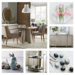
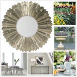
The neutral palette shown in these photos is another wonderful design idea — for both large and small spaces.