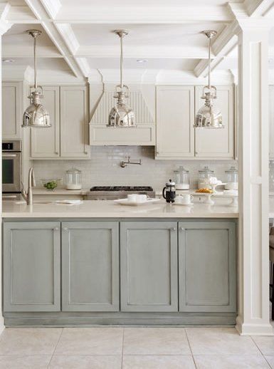
A bright, happy kitchen makes friends and family linger. Photo credit: thekitchn.com.
My favorite kitchens are those that feel light, bright and fresh. So when it came time to give my kitchen a makeover, I knew exactly the mood I wanted to create. I started in my usual manner by pulling ideas from magazines and creating a kitchen ideas Pinterest® board.
Then I began incorporating my favorite design elements into the kitchen—the busiest room in my house.
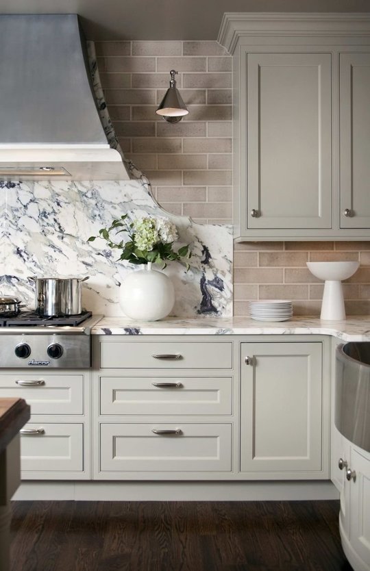
I’m drawn to light tones of blue, green and gray in the kitchen. Photo credit: Decorpad.com
Now when it comes to kitchen makeovers, there are two main types. One is the full renovation—where you accept not being able to use your kitchen for several weeks or months. The second is the refresh—where you change as much as you can of the aesthetics without major disruption to your life. We went for a refresh, which meant focusing on materials and finishes.
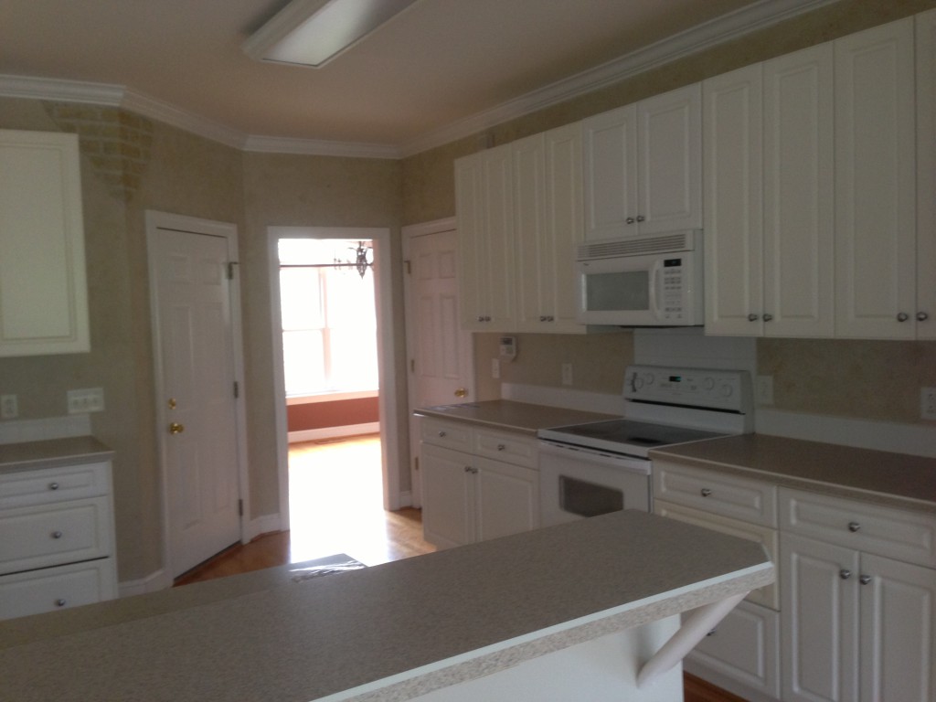
A look at my kitchen before.
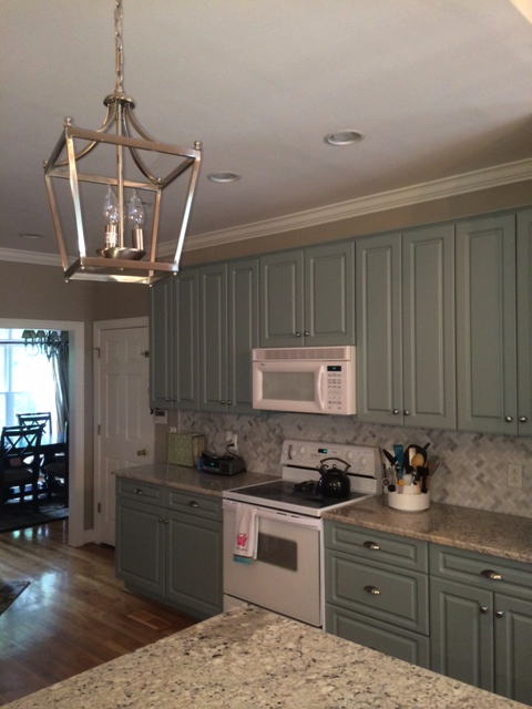
A look at my kitchen after.
Here’s a summary of the changes I made:
- Counter-tops: The original counter was bi-level with a bar-height bar. I think this configuration wastes valuable counter space, so I lowered the bar and made it all counter height. Then I replaced the laminate counter-tops with light-colored granite. And I recovered my barstools to coordinate with the new color palette (see how here.)
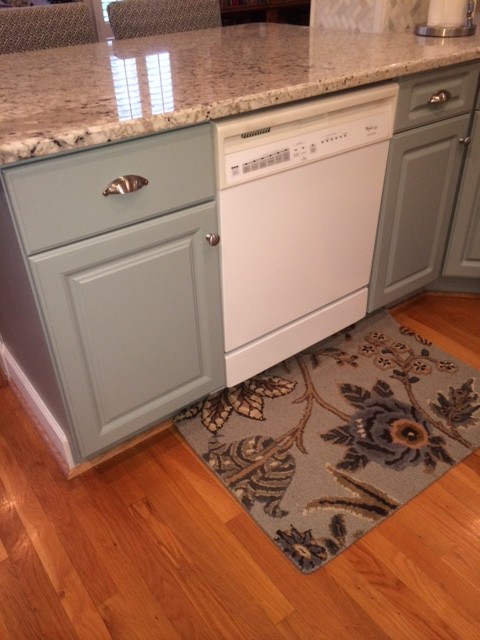
Lowering the bar and extending the counter-top straight out gave me a lot more work surface without sacrificing the eat-in bar.
- Lighting: I removed the one large fluorescent light fixture and replaced it with recessed lighting. I also added two lantern pendants over the island.
- Cabinets: The cabinets were discolored, so since they needed to be painted I went with a color. I chose a lovely light shade of blue-green-gray and then dressed them with brushed nickel hardware. I also added a small crown molding to the top of the cabinets because it was suspiciously missing.
- Backsplash: I chose a gray and white marble herringbone mosaic tile for the backsplash and used a light greige grout to warm it up. I also chose to tile around the column in the island because it frequently gets splashed—and it gave it a nice finished look.
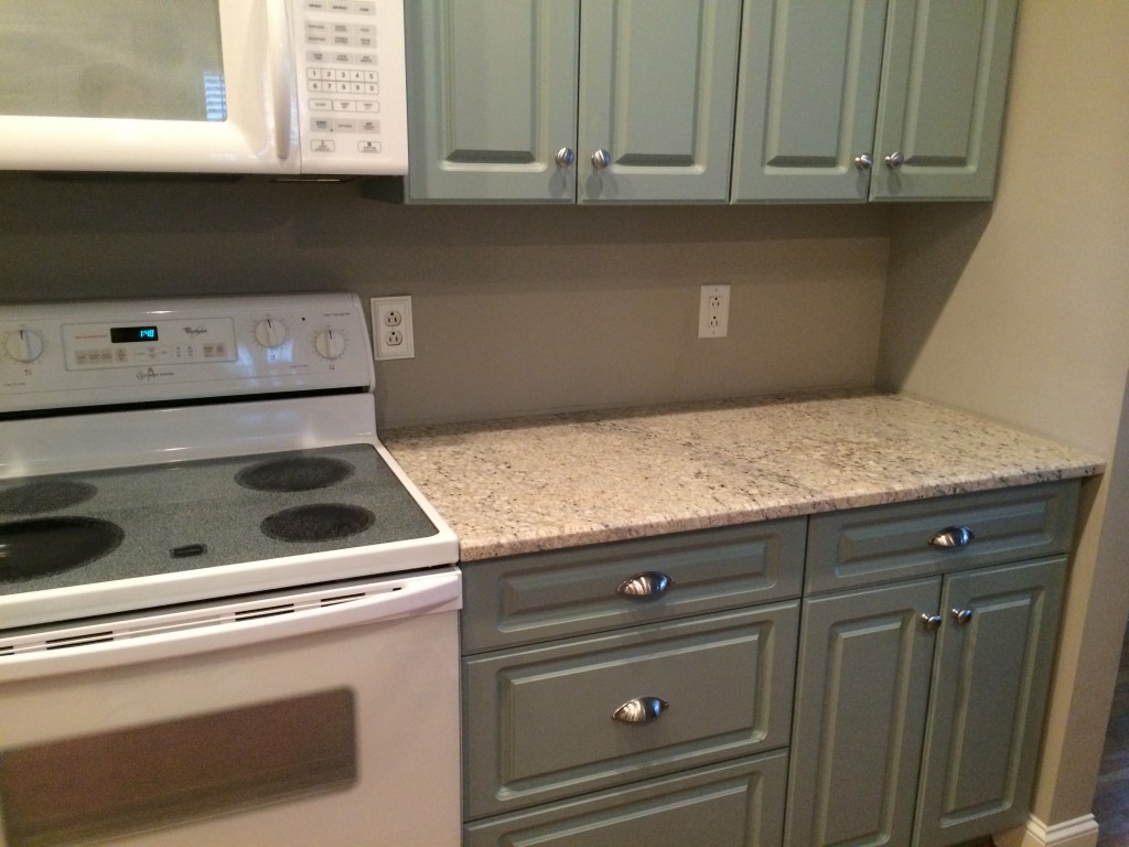
Mid-way through the project, with newly painted cabinets and countertops, but no backsplash yet.
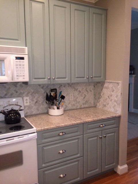
The finished look with the marble mosaic tile backsplash.
- Sink: I replaced the existing shallow, white porcelain double-bowl sink with a single-bowl deep stainless sink and matching faucet.
- Paint: The dated faux finish on the walls just had to go! The kitchen and adjoining sitting area are now all painted in the same neutral greige tone.
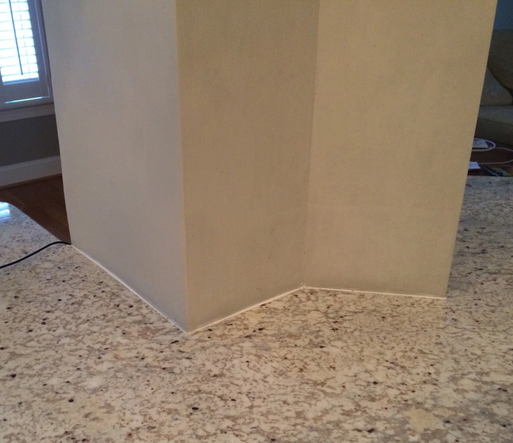
A load-bearing column in the middle of the island presented a challenge.
The island has a load-bearing column in the middle of it. The previous owners addressed this by giving it a faux finish—which I think drew attention to it, so I painted it the wall color. Unfortunately, the sink is located to the right of the column so it frequently gets splashed and the paint was becoming discolored.
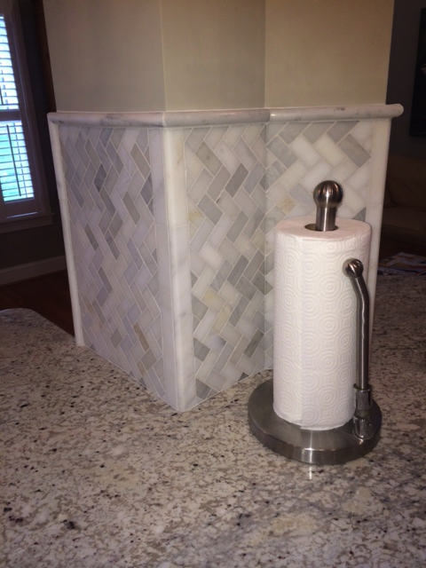
Our solution to the load-bearing column
My solution was to continue the backsplash tile on this column, and it is now more attractive and functional.
My kitchen refresh is nearly complete—the last element is new appliances. Stainless appliances will give it a finished look, but the existing white ones don’t bother me as much as I thought they would. So I’m in no rush to replace them while they operate well. I’m not sure what I will do when it’s time for new ones…What do you think I should install when the time comes? Stainless steel or new white appliances?
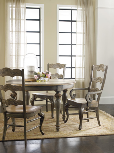
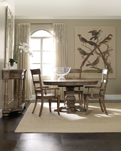
And no kitchen makeover is complete without the perfect dining table…
I love the hand-painted look of La Belle from Hooker Furniture, and its lovely finish would blend perfectly with my kitchen’s muted color scheme.
I can also envision the creamy finish of the Sorella Pedestal Dining Table and its ladderback chairs complementing the new look of my kitchen as well.
Which kitchen table and chairs do you think is the better fit? Let me know your opinion about the tables and the silver or white appliances in your comments!






{ 0 comments… add one }