

Caliente Chest
Are you looking around and starting to notice that your color scheme is feeling a little dated and tired? When was the last time you spruced up your home by introducing a fresh new color to your palette? About two years ago I started to feel the same way and began to ask myself the very same question. It was right then that I knew a time for change was desperately needed.
Once I made the decision to do something different with my color scheme; the next step was to decide on what colors I wanted to utilize. I’m a firm believer that you should always go with what you love, and if a certain color speaks to you… use it! So with this go around, I was determined to try something with just a little more edginess.
A few years ago; warm and homey was the trend. Rich deep colors of reds and earthy browns, along with golden colors of yellow, could be found everywhere. Fabrics a plenty and accessories galore expressed the warmth of these colors within homes and retail stores, but now we are starting to see vibrant and bold color combinations gracing homes around the country.
And although these warmer colors will remain as classics, I knew I wanted to do something a little different. So after researching what was out there… I found the courage to be a little more daring this time!

Bold & complex patterns gain popularity
Trying to decide on what colors suited my interest became a challenge because I am a collector of sorts; therefore, the last thing I wanted to do was replace my entire collection of precious memorabilia with all new stuff. So the first step was to give myself a color evaluation.

Veira Chest
I began to consider the colors that had a tendency to catch my eye the most. So when I would be out and about running errands or shopping my favorite places; I took note when something would draw my attention. Then the next question was to ask myself “Why?” This helped me to narrow down my options quite significantly.
Over and over the color of choice was blue/green combined with browns and green like those found on the Veira Chest from the Melange Collection above. In fact, blue/green has been a long time favorite of mine and has always had such a positive effect on my mood, so the choice was obvious… and I had to use it!
This was going to be a bold move for me since I had always taken the safe route of sticking to more expected combinations. Especially when I knew the challenge I was facing was combining this strong tone with red. Branding my spaces with the colors that I love had become my goal and I knew the style influence would be unique- making it very special to me.

Vintage Stamp Chest
Since I have always had a flare for the vintage; I knew that I didn’t want to compromise my style. So finding pieces that introduced blue/green into my decor became a challenging venture. And with every decision; balance and placement become the center focus. I wanted to make sure that I was not too heavy in certain areas with this color because of the bold contrast of the red.
So for me it wasn’t just about finding pieces that could work, but they had to fill certain spaces too, considering that I had just moved into a summer cottage where space is limited.

Tyfani console by Hooker Furniture
Once I started moving forward with my decision and I began to acquire stylish pieces, the most extraordinary thing began to happen. I started noticing my color combination popping up on furniture, fabrics and prints!
Suddenly I began to realize that I was just slightly ahead of a color trend that was making its way into the marketplace, which for me was very exciting!
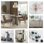
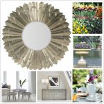
I picked some accents to match my new color scheme.


But of course nothing was more thrilling than when I found the crown jewel of pieces that pulled it all together for me. A one of a kind vintage cabinet from a company that used to be in Chicago in the early 1900’s by the name of Revell Furniture Company had become the anchor piece to my combination.

The detail shots above show the intricacies of this cabinet by Revell Furniture.
So without reservation and full of joy, I bought the cabinet and brought it home to unify my color scheme. And within that moment it dawned on me… I wasn’t the first to come up with this combination. Someone else had thought it up long ago! And now it is my pleasure to share in the idea and make it new again!


{ 1 comment… add one }
This is really beautiful color combination to see in a such way with some antic collection…