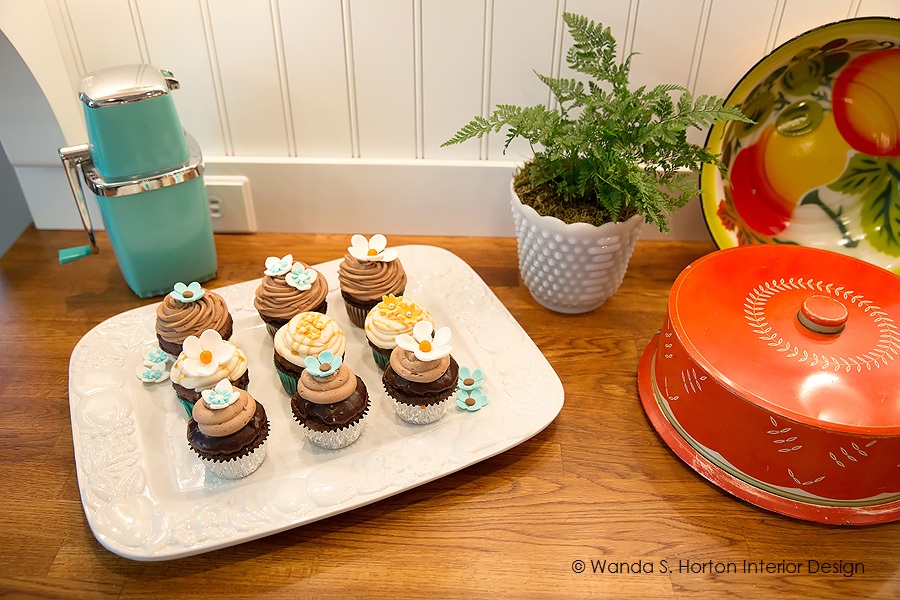
A few blog posts ago, I promised to share more about a town home project where I created a special, modern cottage design for a young teacher. I believe I even promised there would be cupcakes!
While I may only be able to tempt you with images of these delicious treats, I can certainly share some details about the lovely project in which they were photographed, as well as some thoughts about creating a beautiful kitchen and dining area in your own cottage-style home. It seems like summer is the perfect season for keeping design colorful and crisp for kitchen table and chairs and everything that goes into an inviting kitchen.
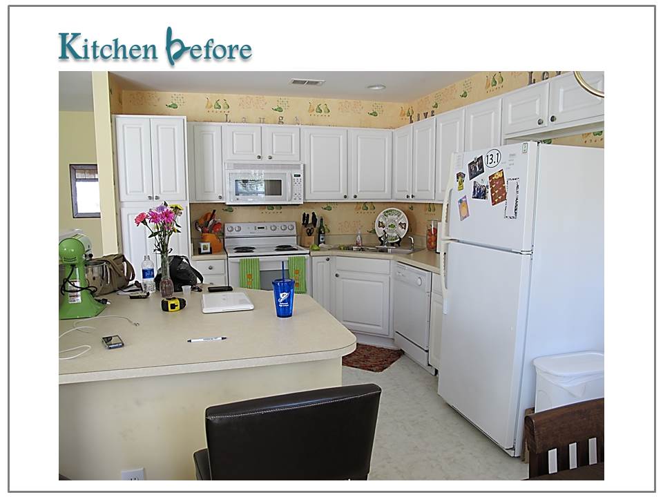
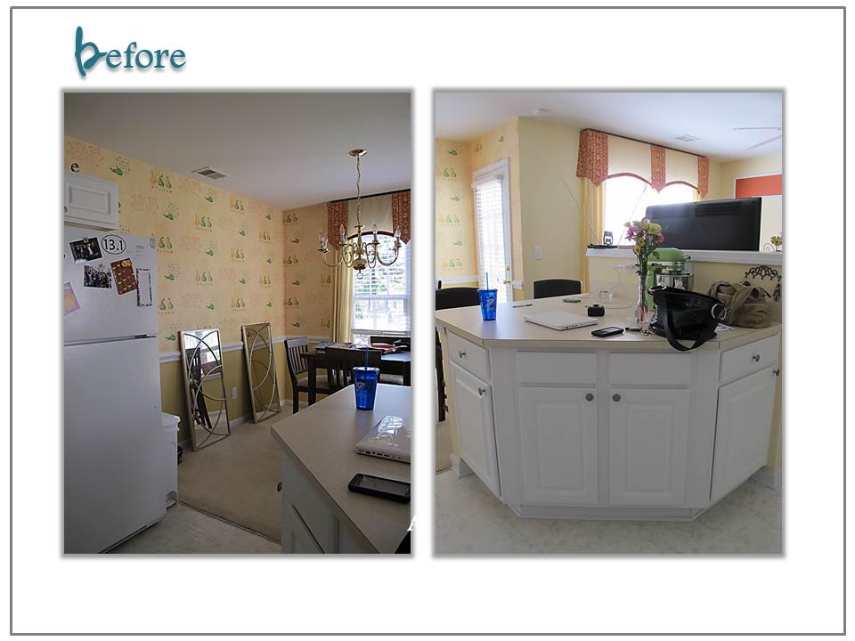
One of the challenges with an open concept design is just that . . . it is open to everything! The previously featured living room area had a clear view of the kitchen. It might have been nice for carrying on conversations, while cooking, but my client thought it didn’t work well when everyone wanted to retreat to another space for visiting or television viewing.
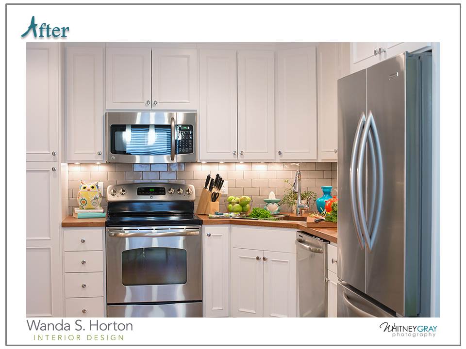
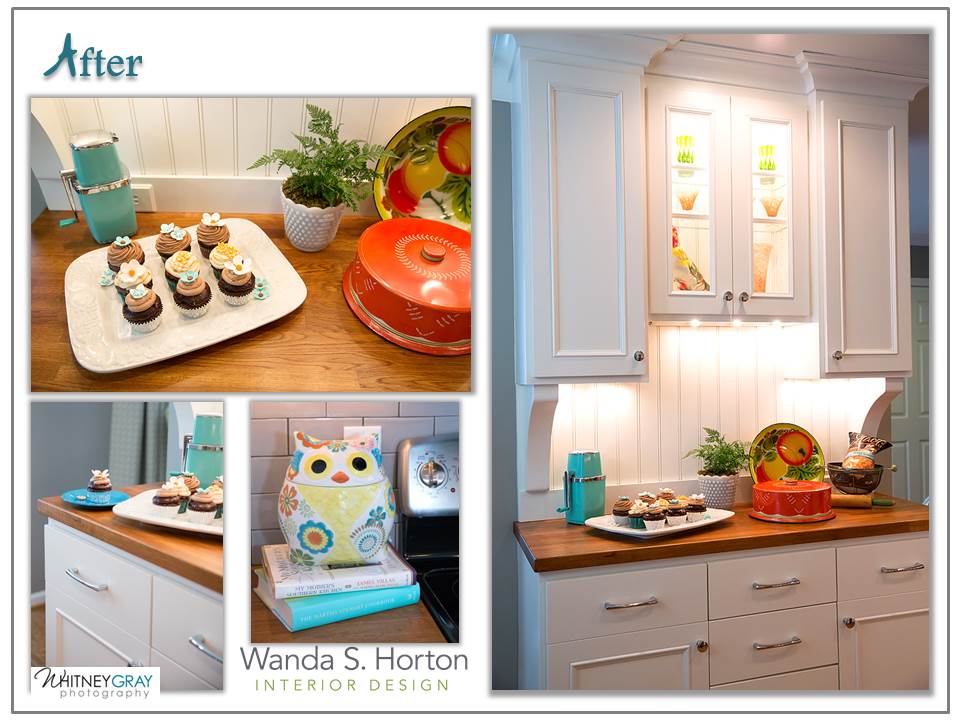
The first thing we addressed was functional wish list items: taller cabinets for more storage and better hidden features. I also knew we could create a bit more grace in the view by carrying the eye upward. The refrigerator became part of the cabinet design rather than appearing so bulky. The chunky island disappeared and you’ll see how we used a cupboard, backed against a wall, to add more storage while utilizing it as a room divider, too.
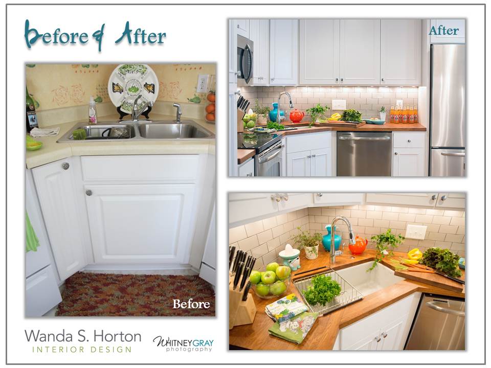
The counter tops were replaced with wood and a soft gray Kohler under-mount sink provided a streamlined-look as well as capturing a few more inches of surface space. It’s actually easy to maintain with a food-safe and waterproof sealant. Using wood makes for a more casual look, which cottage interiors are all about.
You can see how using the cupboard, instead of the original island, made for a great china cabinet/ storage solution, as it added so much to the architecture that had been lacking in the design. We used the same cove/crown molding throughout the rest of the town home for continuity – an important design element in making small spaces seem larger. We wrapped it up onto the ceiling, with a ceiling plate, in order to prevent visually shrinking the height of the walls. Scale is so important in the process of proper design. Sometimes, you can use visual tricks to manipulate your perception.
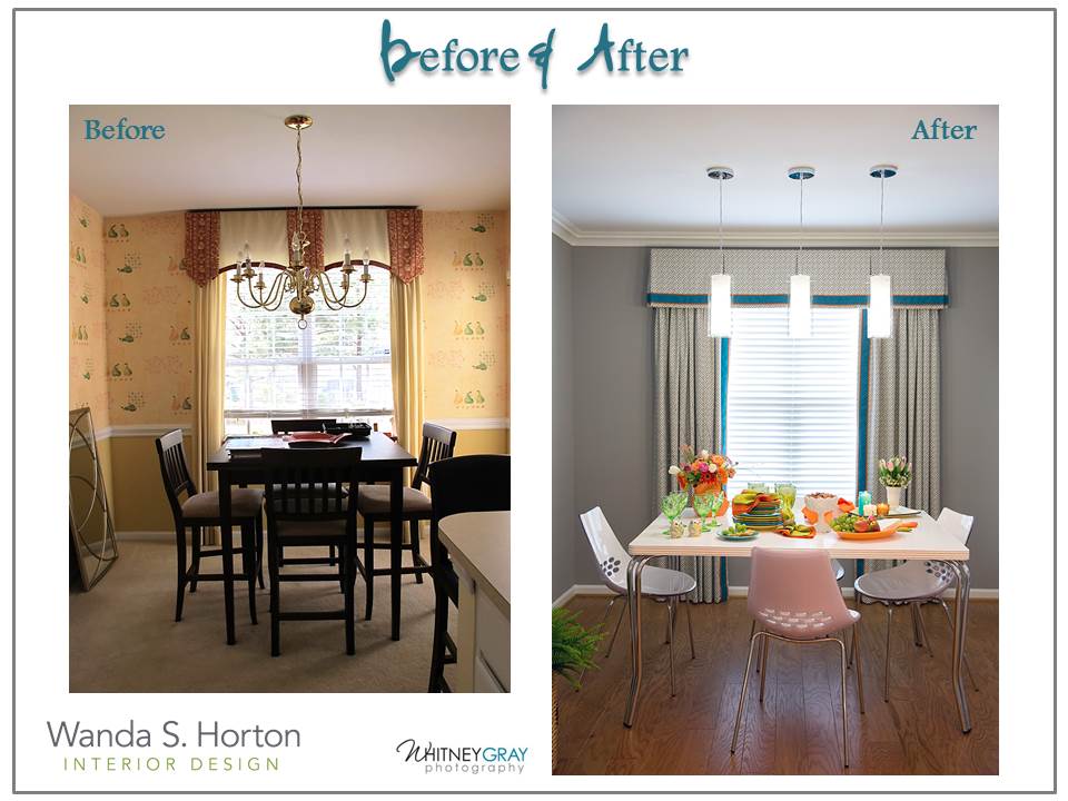
At the other end of the kitchen area, there is a small dining space. Originally, it was carpeted and so it was recovered with a floating, hardwood floor.
It’s always a good idea to determine what lies underneath the foundation before specifying materials. This home had a concrete slab so it dictated certain specs in our design process. I hope you think the ‘after’ is as wow as my client and I do!
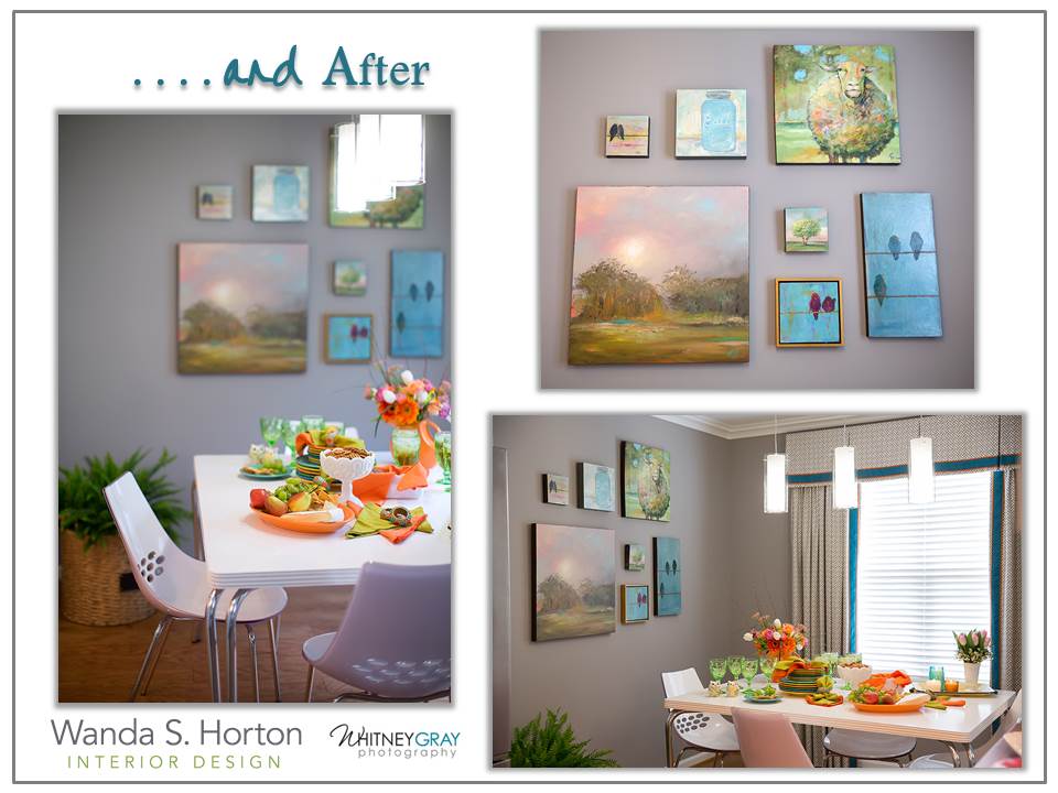
Keeping the background color consistent helped to keep the eye moving along for an expanded view. Using bright accent colors, in personal collections, gives the needed boost and brings a delightful balance. A custom kitchen table and chairs fit the space just so.
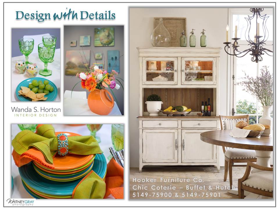
If you’re looking for inspiration for designing your own kitchen, you may want to look in your cupboards and china cabinets to get a jump start. My client had collected Fiestaware, and she loved all of the colors, as well as the simple lines. She knew she liked the idea of mixing vintage with modern but she wasn’t quite sure how to blend the two together.
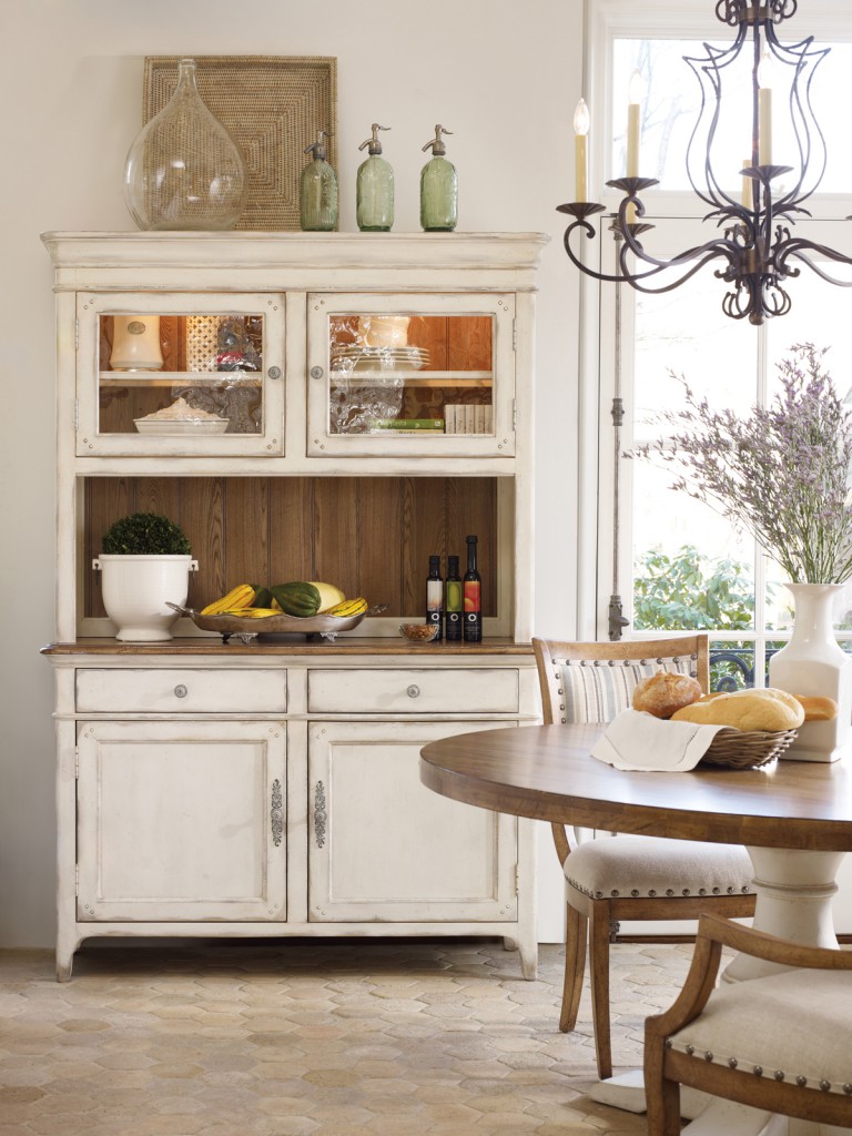
If we had not been able to create some custom storage and dining room buffet pieces, I would have looked at a line like the Chic Coterie Collection from Hooker Furniture, as there are many pieces inspired by Pinterest users who literally demonstrated to the design team what they really liked by pinning and repining ideas to their boards. There is definitely a cottage flavor to Chic Coterie.
Designing with the details can define your interiors with your own personal style!







{ 3 comments… add one }
Love it! Where did you get the wood countertop material?
Hi Elizabeth – I’m so glad you enjoyed the post! The countertop material was purchased through IKEA and we had our painter do some light sanding, between coats of the sealer, to make them buttery smooth.
Hi Elizabeth – I’m so glad you enjoyed the post! The countertop material was purchased through IKEA and we had our painter do some light sanding, between coats of the sealer, to make them buttery smooth.