
One of this season’s favorite shades is a plush peacock blue. Paired here with a sleek leather and modern chrome legs creates an edgy elegance. Photo: Bradington-Young.
Color captures attention before anything else. So if you’re looking for high-impact home updates this fall, go for color.
Pantone’s fall home fashion 2016 lineup includes some of the expected autumn hues on the cozy side of the color wheel. But they’re set off by a batch of cool, unexpected tints and tones you’d expect for spring.
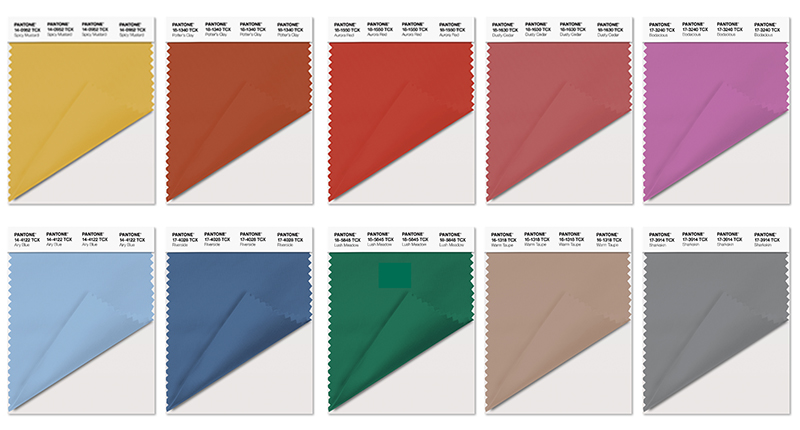
While Pantone’s fall 2016 colors include warm tones like Spicy Mustard and Aurora Red, the blue family, which conveys a message of calm and constancy, leads the 10-color palette. Photo: pantone.com
Leatrice Wiseman, Executive Director of the Pantone Color Institute™ says that, “The desire for tranquility, strength and optimism has inspired a Fall 2016 color palette that is led by the blue family.”
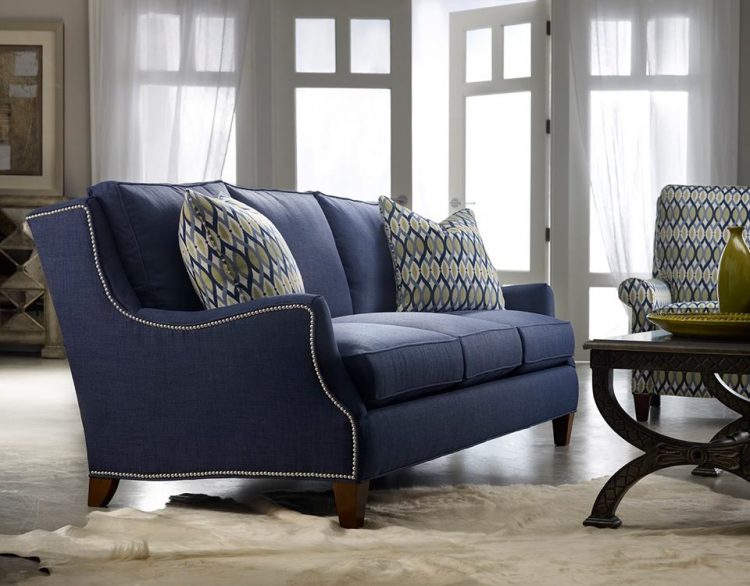
Energy meets style in the Tansy Sofa, with a jaunty silhouette and dapper denim-blue cover. Photo: Sam Moore Furniture.
“Along with anchoring earth tones, exuberant pops of vibrant colors also appear throughout the collections. Transcending gender, these unexpectedly vivacious colors in our Fall 2016 palette act as playful but structured departures from your more typical fall shades. Blue skies represent constancy as they are always above us. Grays give a felling of stability, red tones invite confidence and warmth, while hot pinkish purples and spicy mustard yellows suggest a touch of the exotic,” she said.

This fall, get ready for the blending of warm persimmon with shades of blue. A perfect marriage of warm + cool. Photo: Sam Moore Furniture.
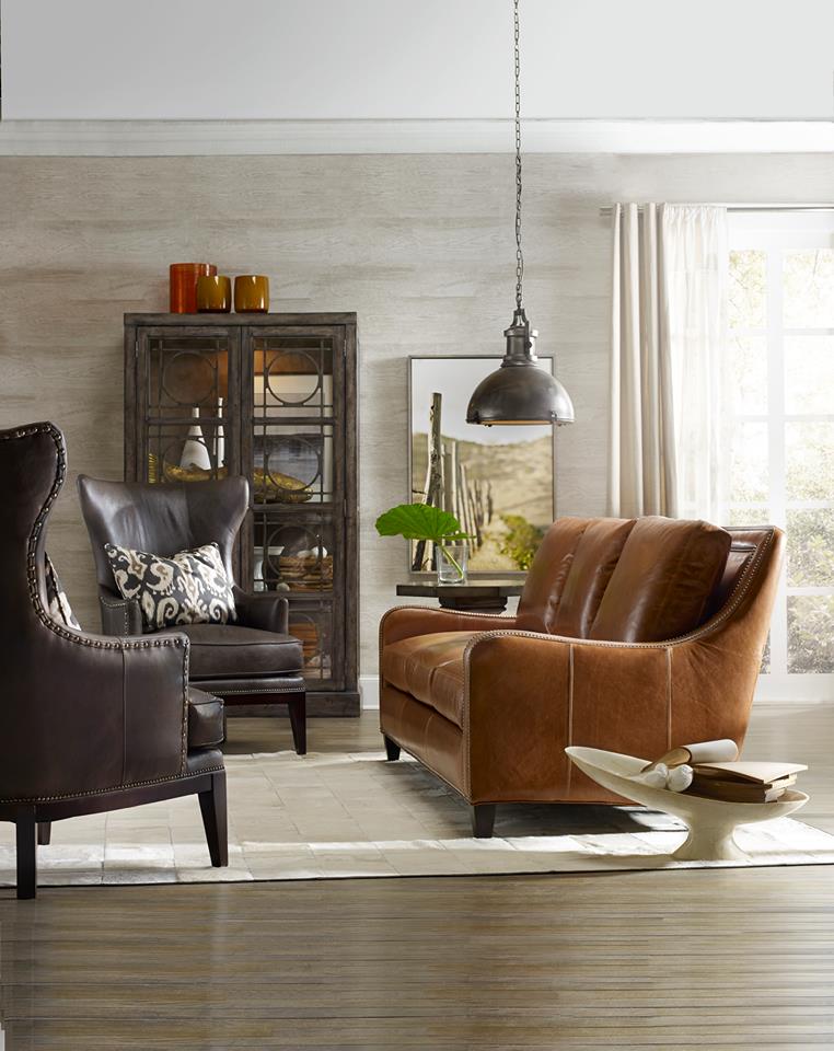
Warm up the conversation and energize your day with this combination of charcoal and caramel leathers featured on the Greco sofa and Taraval wing chairs. Photo: Bradington-Young.
Personally, I’m excited by the prints I’m seeing — patterns that energize classic colors or toughen up pretty ones. When I’m stuck for a decorating plan, I like to pull colors from a great print like one of the ones showcased below.
This fall, it couldn’t be easier to go beyond the usual orange and brown to celebrate the season in your own personal style.
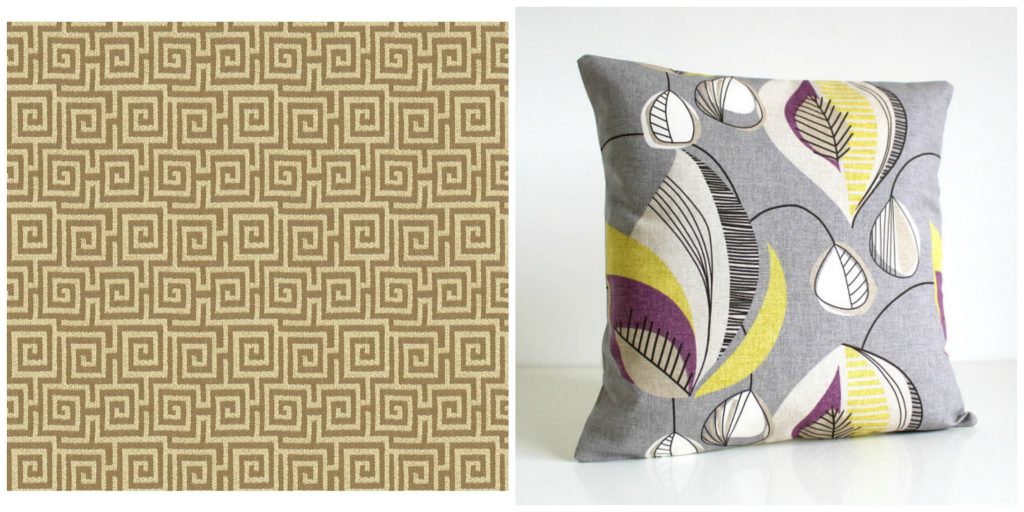
The architectural Greek key motif is one of my favorites, and in taupe, it works with just about any print and color. A retro, organic print in mustard and purple on gray says fall in a chic way. Fabric: Sam Moore Furniture; pillow: CoupleHome on Etsy
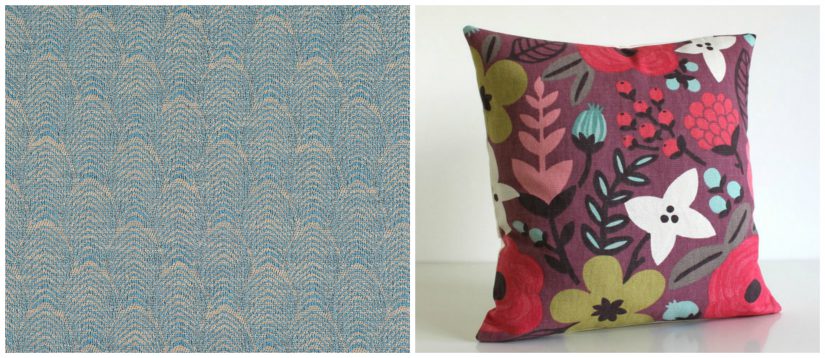
The washed denim blue is youthful and versatile, like all of this fall’s favored blues, and the subtle feather motif is special. I like it with a mod floral that balances rich mulberry-purple, gold and red with soft gray and pale blue. Fabric: Sam Moore, Pillow: CoupleHome on Etsy
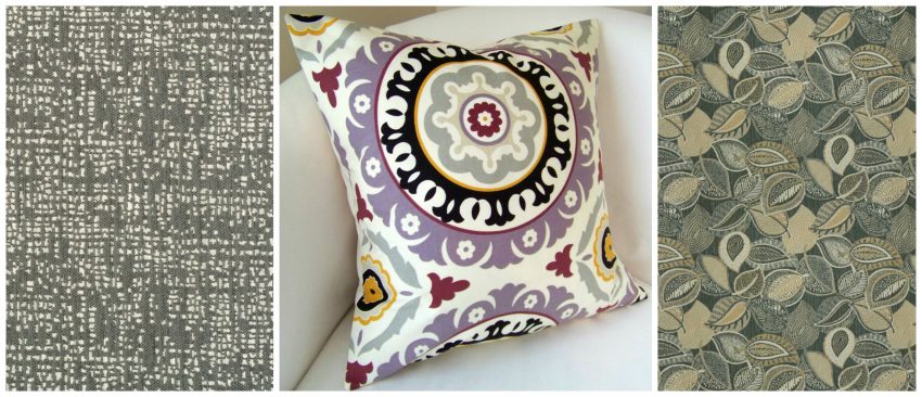
Gray is graceful, not grim. these two patterns show you why. The edgy gray reminds me of nighttime city lights; it’s not the usual checks or tweed but something far more interesting. The steel mini-leaves are exactly what Pantone says this fall should be: playful but structured. Different as they are, both these grays would work with any modern or retro pattern, but I like the intrigue of a timeless Suzani design in fall’s mustard, purple and red, anchored with black. Fabrics: Sam Moore; Pillow: Etsy.
Love a vivid print like this but aren’t sure about using it a lot? Keep in mind that it’s a truly classic pattern, one that can hide the marks of family life better than most, and one you can calm down with any solids or small prints you like. Here’ fall’s complex, warm hues or red, clay and mustard are abundant, nicely cooled with pale blue and taupe. Photo: Sam Moore
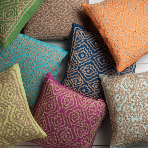
Geometric jewel tone pillows like these project a rustic, artisan vibe. Photo: overstock.com
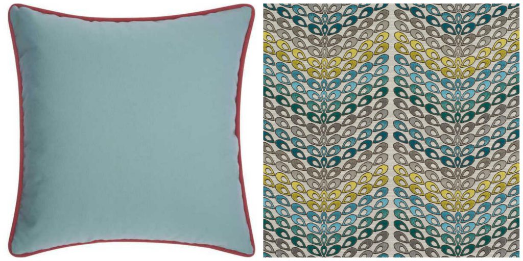
Remarkable raindrops in tiers of blues, golds, taupes and grays are another example of playful but structured. Pull out any of these placid hues for accents, or up the energy with a contrasting warm hue. Remember to use any color at least three places in your room for eye-pleasing unity. Fabric: Sam Moore; pillow: overstock.com


{ 1 comment… add one }
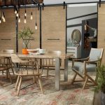
Dining Room is an important place in one’s home, a place where everyone sits together and eats, shares stories, shares laughs. Purchasing furniture for dining table can be a little tricky as you have to see if it matches the home decor or if the dining table matches the dining chairs. You have to make sure that whatever you pick should enhance your dining room’s look.
See More: http://www.vijaydeals.com