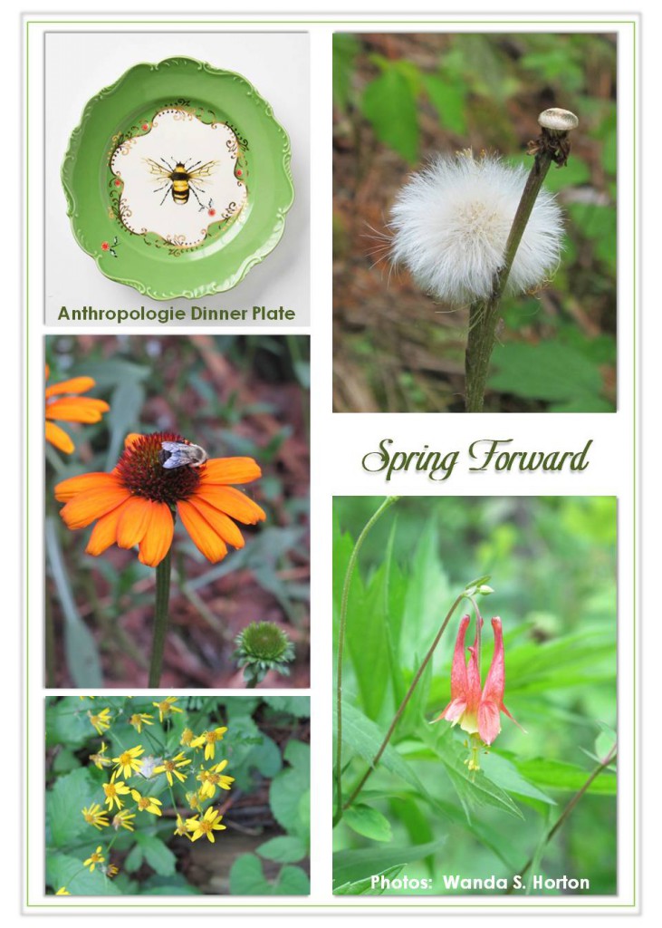
In my opinion, there is no designer more inspiring than Mother Nature. As an avid gardener, I’m constantly reminded of the vivid colors, textures, and patterns when I begin to see the buds forming on trees and as the foliage and flowers burst into their full splendor. It’s the time of year when I begin to sort through catalogs and chat it up with my favorite greenhouses to decide what I’ll plant as soon as the weatherman gives the thumbs up. There are some definite tried and true plantings, as well as new varieties or colors. Hmmm . . . Sounds like trends are alive and well in garden design, too!
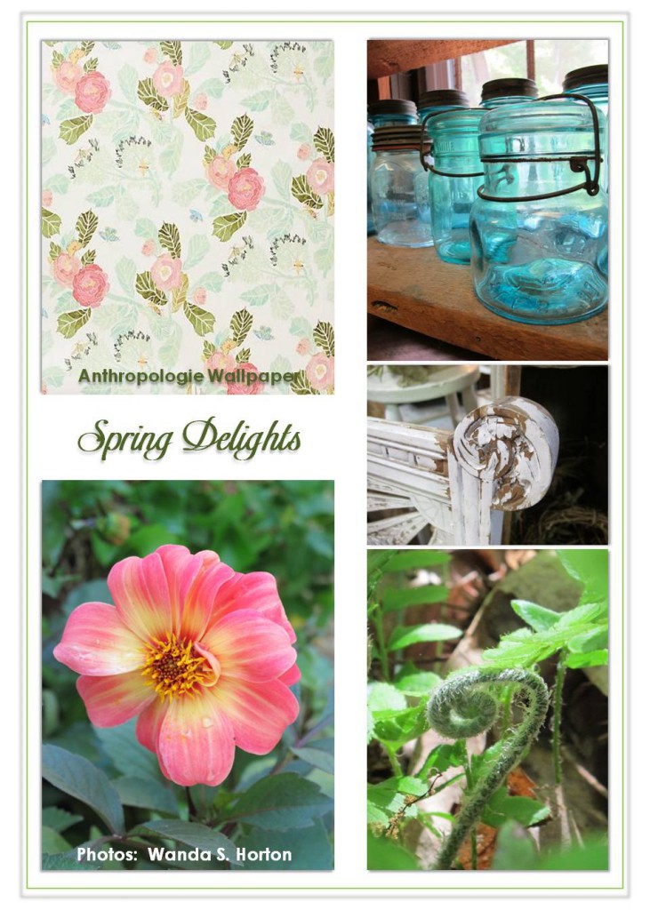
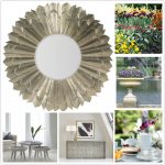
While I’ve been browsing through my photo albums of last year’s beauties, it brought to mind how natural influences are translated into interiors and accent furniture. Of course, I just had to create some inspiration boards to share with our readers of the “Experience YourHome” Blog for Hooker Furniture. Even though spring-like weather might be a little far off for some areas of the US and the world, perhaps you’ve also curated ideas to help you shed the winter doldrums. It’s easy to compile them for reference as you consider refreshing you home décor with a touch of nature!
Fabrics and wall coverings are excellent ways to insert a little “flower power.” While some folks are quite at home in a room full of posies, others are a little worried about them taking over like a pesky vine of Morning Glories. Aside from accent pillows, I like to think about placing a pattern in the back of a bookcase or on the front of a flat door panel. Of course, they can also be framed for lovely wall art. If you have modern leanings, there are more stylized designs to be found. Often fern patterns or branches work well as floral substitutes, especially when trying to keep a space a bit more gender neutral. I personally enjoy a pretty garden cottage, so I’ll search for added texture in picture frames or in accompanying furniture pieces. Of course, just as in many gardens, there has to be an exercise in control of appropriate scale and layout. Even what might seem to be created with casual abandon usually has a plan behind it.
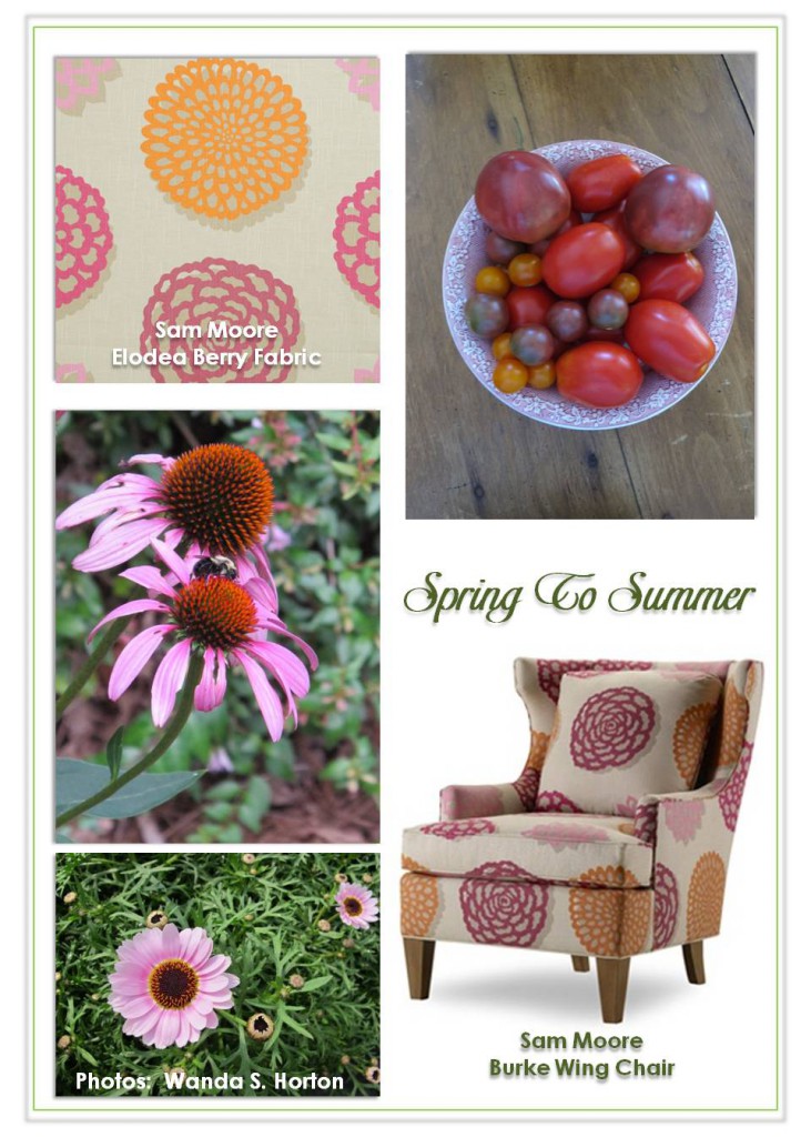
As vivid as is Mother Nature’s imagination, so goes the color palette! In 2011, “Honeysuckle” was selected as Pantone Color Institutes “Color of The Year.” Rather than being the creamy tone most of us think of when we think of honeysuckle, the 2011 top color was inspired by a more cultivated variety of honeysuckle that leans towards bright pink. (My mother has a gorgeous vine of it draping over a picket fence!) As we moved into 2012, “Tangerine Tango” took over the honor of Pantone’s color of the year. It’s a spicy hue and I’m a big fan. Of course, I think Honeysuckle has danced right into the arms of Tangerine, don’t you? Just watching the combinations of the two, such as on Sam Moore’s Burke wing chair have made for a lovely coupling. The centers of my coneflowers and some of my heirloom tomato varieties would fit perfectly on any designer’s current swatch board.
While the March winds blow by, I’ll be comforted in knowing the days will be longer and a renewal is on its way. I’m already inspired and I hope you are, too!






{ 0 comments… add one }